The prints are shown at their actual size; they have not been reduced . . .
but the entire repeat is not shown in the large prints due to download time,
which will still be a couple of minutes on some computers. Still, it’s worth the
wait.
Viva la France! Get ready for some new colorways you ha ven’t seen on the
19th century reproduction fabric market before. Most of the designs were chosen
for FreeSpirit by the staff at Le Rouvray, a quilt shop in Paris. Others, that
compliment the larger prints, were found in an original sample book of Parisian
fabrics which date from 1848–1849. Document colors are not indicated in this
line. It is an adaptation of original prints. The French terms are ones I have
come across while reading books about French fabric, which are noted at the end
of this review. ven’t seen on the
19th century reproduction fabric market before. Most of the designs were chosen
for FreeSpirit by the staff at Le Rouvray, a quilt shop in Paris. Others, that
compliment the larger prints, were found in an original sample book of Parisian
fabrics which date from 1848–1849. Document colors are not indicated in this
line. It is an adaptation of original prints. The French terms are ones I have
come across while reading books about French fabric, which are noted at the end
of this review.
This is a stunning collection of fabrics and I emphasize collection. It is not
matchy matchy- the same prints are not repeated over and over in different
colors. Four is the most colorways of one print and being a large scale floral,
you will appreciate the choices for this potential focus fabric. Most of the
prints come in two colorways. The line totals 28 fabrics, so you can see that it
offers a lot of choices and possibilities. Yet, it will blend nicely with other
lines in your stash.
So what about these new colorways?? The line wouldn’t be reminiscent of France
if it didn’t offer the deep mustards and reds, which it does. And, it wouldn’t
be on the American fabric market if it didn’t offer blues and pinks, which it
does. So what about the new colorways? They fall into a broad range of greens
and taupe - chartreuse, yellow-olive, warm sage and a rich taupe. There are also
Prussian blues, ones that are more green and others a darker blue, brighter than
indigo blue.
A musical instrument theme is placed on a taupe and a warm sage ground. In the
early 19th century it was a toile peints, a multi-colored block print
made in France. This style pf print, and those with trophies, ribbons, and
baskets are typical of Louis XVI style of decorative arts.
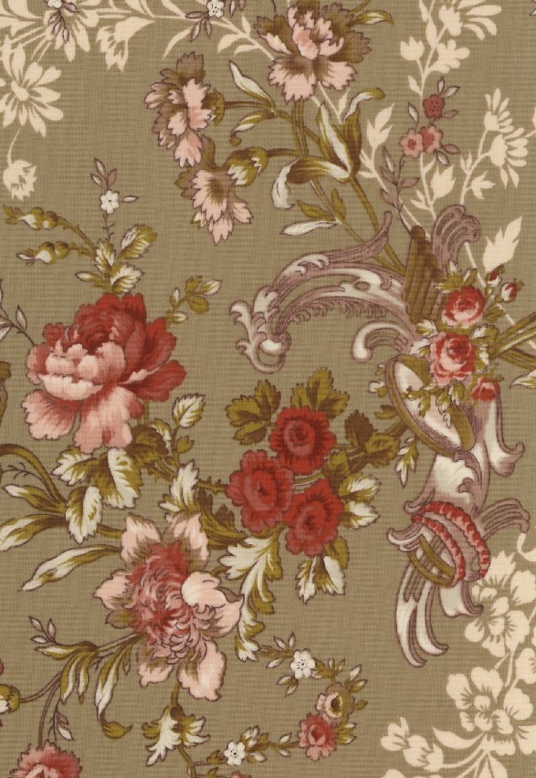

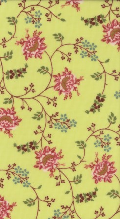
Another large scale floral toile peint in the group has daisies, roses or
rosettes, and three other flowers I can’t name, but a gardener could as
these are naturalistic renditions of flowers. This was the preference in the
neoclassic and Empire periods. They appeared tossed across the field. This type
of design was referred to as fleur dans le vent, flowers in the wind.
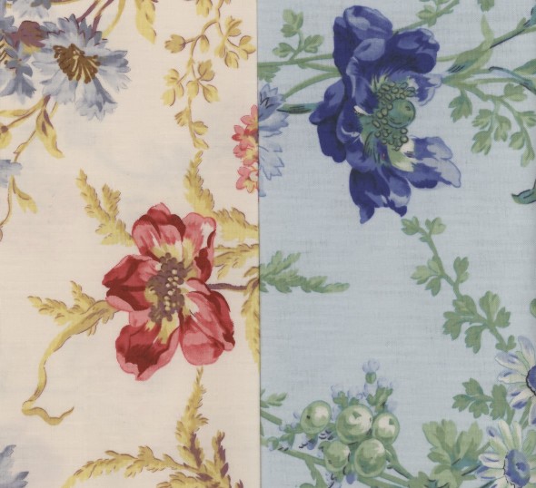
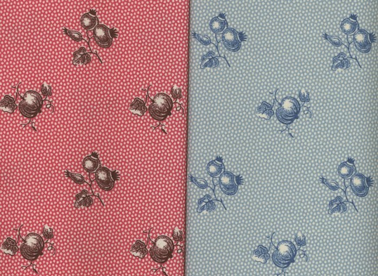
There are four ground colors, white, light blue, yellow-green and pink, but each
print includes red roses and blue flowers. If this print had blue flowers in
it’s original version, the blue would have been penciled on by hand.
In the second decade of the 19th century, stripes in designs began to
flourish in all sizes of strips, from pinstripe narrow in the background to very
wide and a main element of the design. Some extra wide prints, such as this
chartreuse ground colored one, would function in different ways, making them very popular patterns. They
provided decoration for dress hemlines and waistcoats, edges of draperies and
tiebacks, and borders for bedcovers and valences. Today’s quiltmaker could also
cut these stripes apart for borders or stippey style quilts,
which
were popular into mid 19th century.


Stars, puss in the corner or 4 patch blocks
would be appropriate for the on-point blocks placed between the strips, that
also come in a crčme ground and a lighter pink, each with shades of pink tulips
and roses. The tulips and leaves are especially beautiful, full and lavish, with
shading in many colors to build dimension, which would indicate that it was more
likely printed with blocks than rollers.
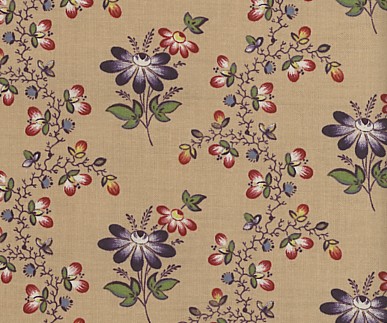
Another hard to find colorway on the market is the
ramoneur. Ramoneur
prints are polychrome flowers on a dark brown ground.
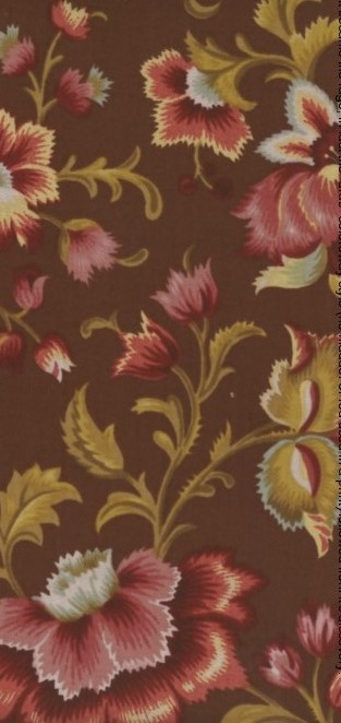 The
earliest were block printed and made from around 1780 to 1850. Dark brown dye
was easy and affordable to make and it hide the dirt well, therefore many dress
prints and furnishing prints were made in the ramoneur style, for men and
women’s clothing.. Brown dye was very hard on cotton, the iron in the dye
deteriorates easily over time with water and light. It gets brittle and cracks
once it is wet. There are not many dark brown chintzes left for viewing today,
but you can make one, using this floral chintz style print that will last much
longer. The
earliest were block printed and made from around 1780 to 1850. Dark brown dye
was easy and affordable to make and it hide the dirt well, therefore many dress
prints and furnishing prints were made in the ramoneur style, for men and
women’s clothing.. Brown dye was very hard on cotton, the iron in the dye
deteriorates easily over time with water and light. It gets brittle and cracks
once it is wet. There are not many dark brown chintzes left for viewing today,
but you can make one, using this floral chintz style print that will last much
longer.
A mineral dye used on this print originally, manganese, was discovered around
1815, which helps date the original print to no earlier than then, and probably
no later than 1850. Manganese is a bronze-green. The pink ground version leans toward the olive or drab color for the leaves.
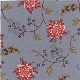
The medium scale prints, offer another with a chartreuse ground. It is a
trailing (curved) vine floral pattern, or rinceaux fleuris. The flower
heads are pink and naturalistic,
 but the surrounding flowers are not. One has an
Indian flair, another could appear in a thirties print. A French blue provides
the ground color of the other colorway. The halos of white around the flowerhead
suggest it was resist or discharge printed a light indigo blue first and then
printed. but the surrounding flowers are not. One has an
Indian flair, another could appear in a thirties print. A French blue provides
the ground color of the other colorway. The halos of white around the flowerhead
suggest it was resist or discharge printed a light indigo blue first and then
printed.
I put this print into the category of a serpentine floral print. Serpentine
prints have a curved stripe and in this case it is a stripe made from tiny
flowers and leaves on an even tinier vine. It is a very sweet print. The
alternate space is filled with a typical French style of a simple daisy-like
flower. It comes in two colorways. It is light and airy and can be a good
background print or soft foreground print.
The other color is mustard and red. Wild Sumac, flowering broom, sunflower petals and of course,
saffron were the locally grown dyes the French used to make the mustard color so
closely identified with their country. They called this color baiso-ma-mio.
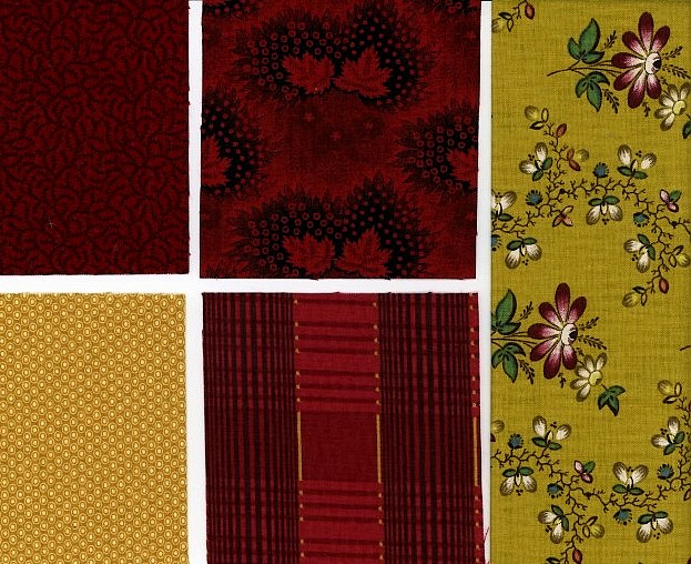
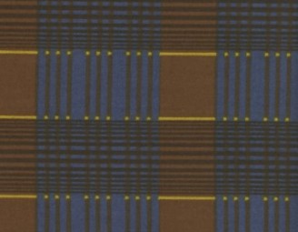
The red on red and gold printed plaid also comes in Prussian blue and brown,
with a thin strip of Baiso-ma-mio.
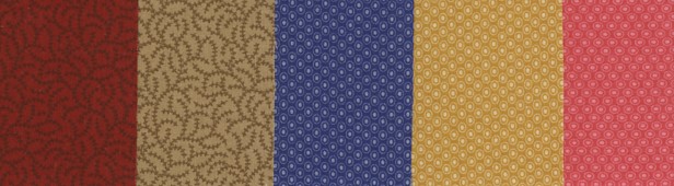
They are
complimented by the filler prints, which are an allover small design that can
read as a solid from a distance, but add texture when viewed closer up. These
would have been roller printed most likely, as they are so tiny.
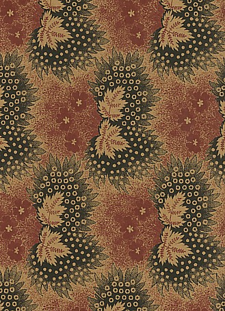
If a design was popular with the public, it was made in a wider range of ground
styles and colors, and variations on the theme. This also facilitated the reuse
of an engraved roller. This may have been the case with the mill leaf print in
red (third photo above here) and in black and red on tan. Perhaps
the first runs of this print only included the leaves and surrounding design in
black. It would have been easy to add the red motifs and make a fresh looking
print. An engraved steel mill dye was used to engrave the roller printer. It was
small and worked like a branding iron, allowing one finely engraved dye to be
used repeatedly on a softened metal roller. This was a quicker method than
engraving each design from hand.
Black and red prints were dyed simultaneously in the same madder bath. Mordants,
metals that helped the dye get into the cotton fibers to make it fast, were
applied first. The black used an iron mordant and the red an alum mordant.
Bonnes herbes prints signify the Provencal regions
love of fruits and herb designs which have been made there for a long time. The
ground was likely roller printed when rollers were perfected enough to make such
a small design well, after 1815 or so, but prior to that, a wood block would
have had pins placed in it to make a picotage background in the circular
design seen in these lovely delicate prints.
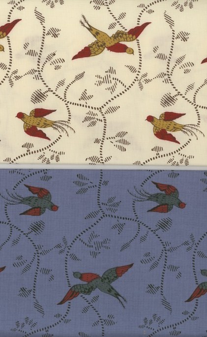
The bird print is unique to the reproduction market too.
The two-tone colored birds are flying in opposite directions over shadows of
trailing vines and leaves. The birds could easily be cut out and appliquéd onto
a block using the broderie perse style. This print could be used in a variety of
ways depending on how it is cut, in strips, squares or individual birds. Or it
would be lovely as a delicate border on a quilt where the center is the main
focus.
This review is long because there is so much to show and discuss. I
think you will agree that this is collection of fabrics worth having in your
stash. Mustards, light greens, taupe, Prussian blues, printed plaids, birds and
four different naturalistic florals in large scale don’t come along all that
frequently in the reproduction market. If you're not already familiar with
FreeSpirit fabrics, you will love the hand and tight weave that offers almost a
glisten in the light.
I want to thank Donna Wilder of FreeSpirit for providing fabric and information
for my review. See their website,
www.freespiritfabric.com, for quilt patterns to download.
For more information about early French cotton prints see my
book list
suggestions. The books I referenced for this article are:
1. “French Textiles, from 1760 to the Present” by Mary Schoeser and Kathleen
Dejardin
2. “Toile de Jouy, Printed Textiles in the Classic French Style” by Melanie
Riffel, Sophie Rouart & Marc Walter
3. “Quilts of Provence, the Art and Craft of French Quiltmaking” by Kathryn
Berenson |