|
Click on Thumbnail views to see actual size.
Reminiscence is an American fabric
collection that looks English or French, which was chosen by a Japanese designer
company. It seems Yuwa Designs in Japan turned to French pattern books in their
own archive of antique fabric to pick these textile patterns for FreeSpirit in
NYC. Everyone loves French designs, including the early English printers. Yuwa’s
French swatch books are mostly from the Alsace region, which includes Mulhouse
print works, and they are from Lyon, the capitol of silk fabrics in France. As
an aside, of interest to fabric collectors, Lyon and the Rhone Valley also
produced Turkey red fabrics, called Rouge Adrianople, which were an orangeish-red.
This dye had been imported from Turkey through France’s free port in Marseilles.
Decades later, in 1776, the secret Turkey red recipe was pirated by dyers in
Lyon and added to the list of many colors of high quality dyes for cotton
produced there.
My impression after viewing this diverse
collection is that both cotton prints and silks in Yuwa’s archives were used as
sources for these adaptations. An Adaptation, as defined in the furnishing
fabric industry, is a fabric type and/or colorway that differs from the original
or document print. The textile furnishing industry was the first to use antique
print fabrics as documents for adaptations for their contemporary customers. One
could easily argue this practice has been going on for centuries, and it has,
but fabric made for quilters is a 20th century business, and reproduction fabric
with us in mind didn’t begin until very late in the century.
This line presents a rich paisley, florals
with pinstripe grounds and musical instruments, a floral mignonette, and a
children-at-play multi-colored toile, among others. These fabrics could be used
in a wide range of periods, in the last half of the 19th century and first half
of the 20th century, depending on the colors.
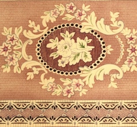
First is a stripe that shines English
Victorian fabric to my sensibilities. I love it! I see it made into a dress back
then, were it a smaller scale, but it’s a perfect scale for quilts, a wider than
usual stripe. I think all the floral fabrics have an English style of print to
them. The English loved their silks, as did the French, and their designs and
patterns were passed back and forth over time.
50% view
Doesn’t this look Victorian to you? The
large swatch is a lilac color in the two thinner strips and a similar but
lighter mauve in the wider strips. It’s subtle. It looks old, not new, because
of the way the print appears to be just barely there in some areas due to
decades of use. I find this version of old quite unique to the world of
reproduction fabrics. A tiny flattened lozenge shape gives the background
density, ‘fading” here and there for the illusion of use. Nor do the motifs have
solid or dark outlines, so they blend into the ground, fading here and there.
The smaller swatches are gold and a pink leaning toward rose. I can see it used
as a border or an alternate plain block in a quilt. It would be beautiful cut
into vertical strips for sashings of various widths.
Thumbnail view - click to enlarge.
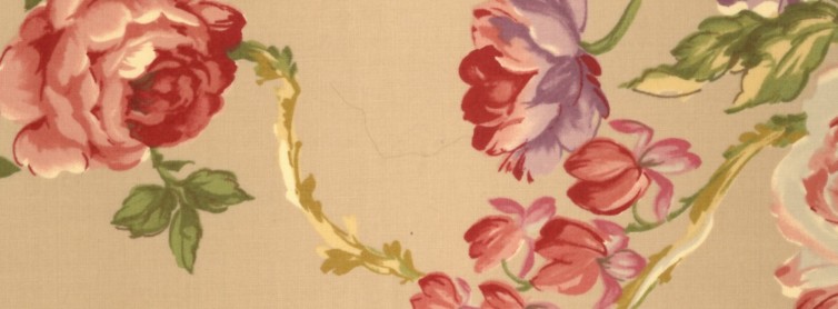
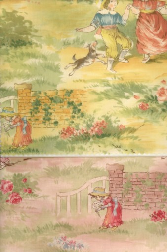
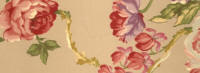
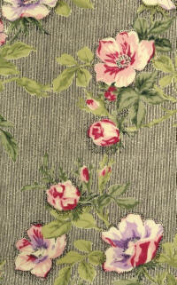
Another print in the line, which could have
been seen in an English or French decor, is a large scale floral with a clinging
vine flowing along on a plain ground, catching a variety of flowers. The largest
flowers are roses. The color combinations are soft. The flowers and
leaves are highly shaded and dimensional. In
the large view, the background color is a light cocoa, and blue and rose are the
alternate colors. (FreeSpirit uses number
codes to identify their fabrics, which you can find on their website
www.freespiritfabric.com)
Thumbnail view - click to enlarge
Thumbnail view -click to enlarge.
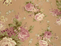
A medium-large floral print is romantic and
nostalgic in its rendition of a musical theme often seen in early French toiles.
The colors are soft and warm -- latte, mellow yellow, and sage green backgrounds.
This fabric would look perfect in a quilt on your daughter’s bed or on your
bed!
Thumbnail view - click to enlarge
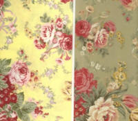
Versatile and feminine, this print is. The
yellow with red flowers is most French and was probably closest to the document
colors.
Thumbnail view - click to enlarge.
The mauve mignonette print, a tiny French
print motif that repeats in an orderly fashion, would be the perfect companion
to the latte colored musical toile.
In bright yellow, the effect is a stand-alone print, very French; they love
strong golds and yellows. It is not the version that becomes an invisible
background! The other colorway has a white ground and pink motifs. This version
could be used in your quilt, just as shirtings are, if you would like your quilt
to have a French flair with a feminine attitude.
Thumbnail view - click to enlarge.
Thumbnail view - click to enlarge.
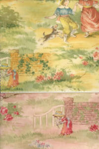
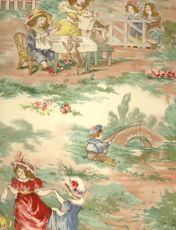
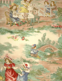
Originally, French toiles depicted
historical events or recorded life as it was then, which is what this
children-at-play polychrome toile is about. Unlike
monochrome toiles, it has the flavor of a watercolor painting. It records
pictures of children and animals playing outside on a summer day. The little
children wear late-Victorian era clothing, and the houses depicted look European.
There are quite a few scenes depicted, of average size. They could be fussy cut
for alternate blocks or be used for the middle of a pieced block, or used as a
border or backing fabric.
Thumbnail view - click to enlarge.
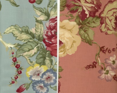
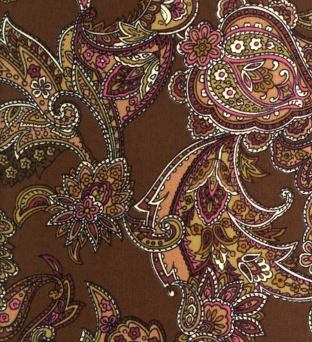
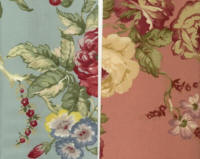
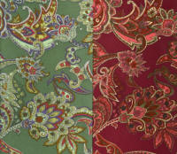
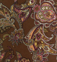 At the other end of the fabric spectrum are
a paisley and a pinstripe floral that are sophisticated and designed with adults
in mind. The paisley would work beautifully in a quilt for a man or a couple.
The background colors are deep and manly, in a brown, burgundy or green The paisley print is not the typical teardrop shape; swag and pinecone shapes, with lots of details in each of
the shapes, give this print a rich expensive appearance. Whether the original
print was a woven silk or engraved roller printed cotton, it would have been an
expensive one to produce. Much later, a dense pattern of this scale and
coloring would be used on the backs of quilts at the end of the 19th century.
Often this type of fabric print was made in a twill weave, rather than plain. In
either case, these prints were called cretonnes. At the other end of the fabric spectrum are
a paisley and a pinstripe floral that are sophisticated and designed with adults
in mind. The paisley would work beautifully in a quilt for a man or a couple.
The background colors are deep and manly, in a brown, burgundy or green The paisley print is not the typical teardrop shape; swag and pinecone shapes, with lots of details in each of
the shapes, give this print a rich expensive appearance. Whether the original
print was a woven silk or engraved roller printed cotton, it would have been an
expensive one to produce. Much later, a dense pattern of this scale and
coloring would be used on the backs of quilts at the end of the 19th century.
Often this type of fabric print was made in a twill weave, rather than plain. In
either case, these prints were called cretonnes.
Thumbnail view - click to enlarge.
Thumbnail view - click to enlarge.
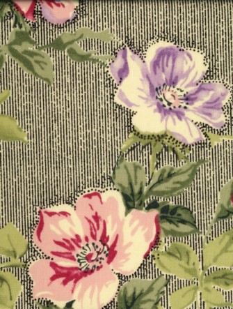
This print, with black pinstripes and lilac
and pink flowers, says 1940s high-style furnishing print to me.
(put photo here)
In the other pinstripe colors of pink and tan, it is so toned down I could see it
used before then, even late 19th century. The tan and pink blend seamlessly with
the other florals, but the black stripes stand out and make a style statement. It
could easily be a focus fabric for a 20th century quilt, or a border. It is
feminine and classy, not for little girls or babies. (put alternate colors here)
Thumbnail view - click to enlarge.
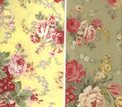
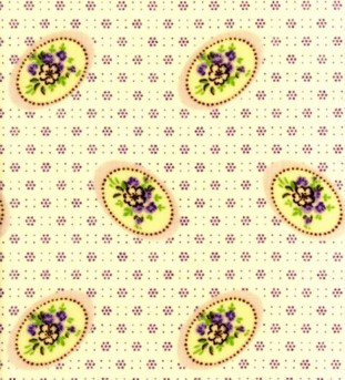
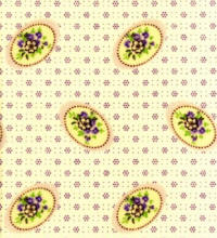
The smallest and most dense of the prints
in Reminiscence is this one. It has a lot of
dimension for such a tiny print. The blue print is shades of blue on white and
would read light blue from a distance. The other two are multi-colored,
green/yellow/red and pink, purple, green. They appear more dimensional and would
affect the
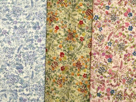 overall quilt quite a bit. Used judiciously or as a primary fabric,
they lend themselves well to this line of mostly large prints. It looks to me
like a roller print to begin with, where a more worn out engraved metal roller is
re-engraved with new motifs, placed in-between the first motifs, which would
print more faint than the newly-engraved ones. overall quilt quite a bit. Used judiciously or as a primary fabric,
they lend themselves well to this line of mostly large prints. It looks to me
like a roller print to begin with, where a more worn out engraved metal roller is
re-engraved with new motifs, placed in-between the first motifs, which would
print more faint than the newly-engraved ones.
actual view
Reminiscence is reminiscent of the
post-Civil War period all the way to the 1940s. Making these adaptations into
quilts, pillows, and home décor items will provide comfort and beauty to
children, women and men. Perhaps this reflects the Japanese mentality, one that
is family-oriented and practical. Thank you Yuwa Design and
FreeSpirit for
bringing this collection to quilters today.
FreeSpirit offers free quilt
patterns (hyperlink quilt patterns to their website) for their fabric
collections. Thank you Donna Wilder, for supplying the fabric and some
background information for this review. |